BID
2022Branding & Web design
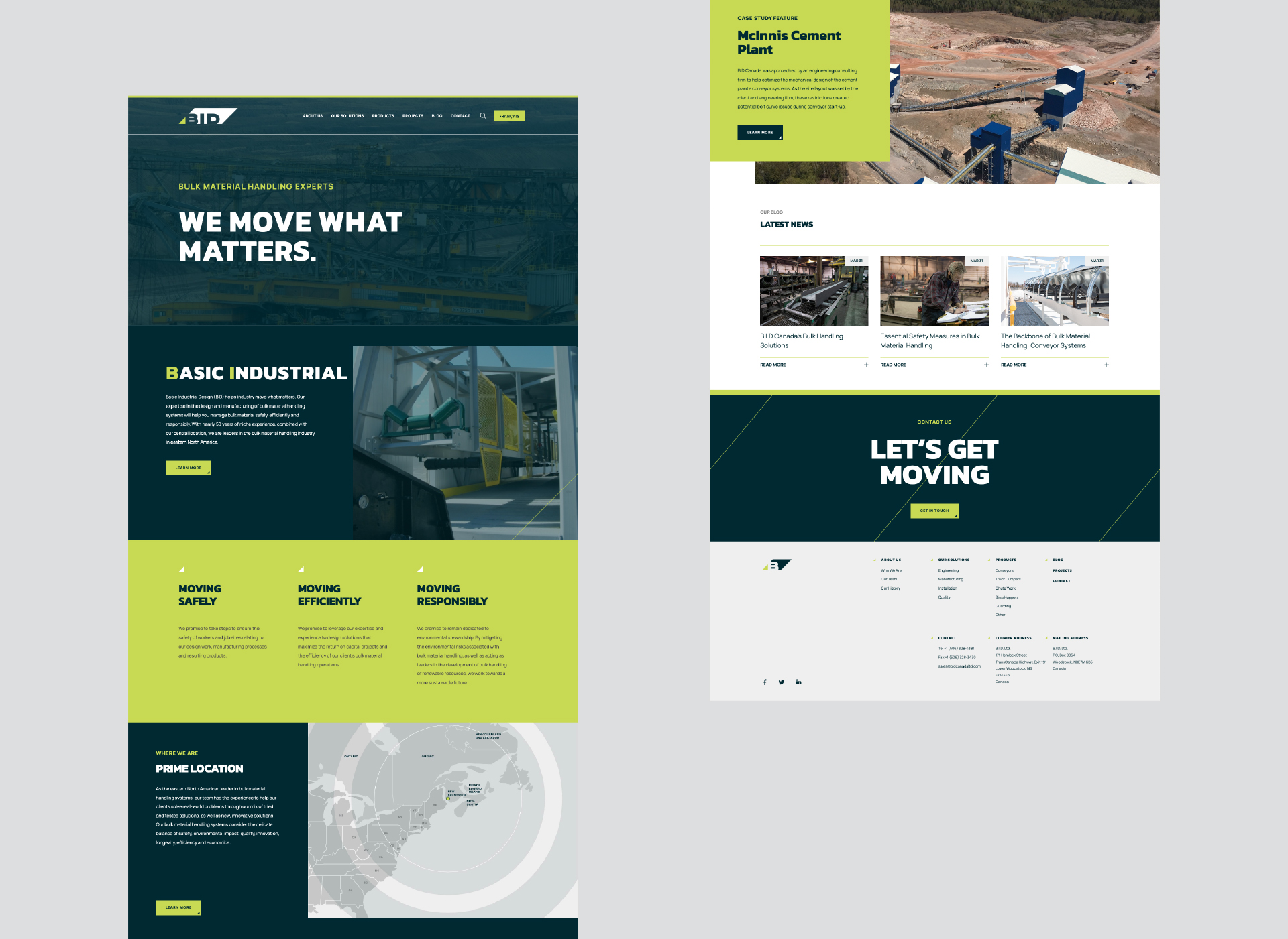
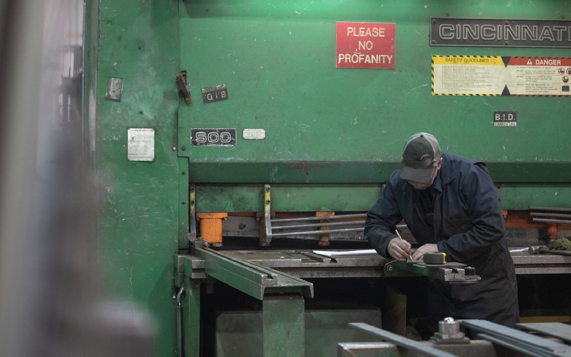
“B.I.D. Canada ltd. Is a custom design and manufacturing team that provides and maintains tailored bulk handling solutions to our client’s unique business problems.”
From: bidcanadaltd.com
![](https://freight.cargo.site/t/original/i/d45b0434143cbfce5327a5d66152e7a92f410031140de918cb262fe3ba781b89/BID-1.jpg)
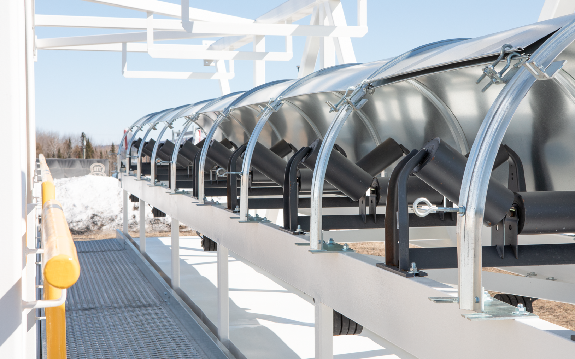
At it’s beginnings, BID was formed as a “one-man engineering service, providing engineering and layout drawings for industrial clients on various types of projects. As the company’s success grew, one offering was in particularly high demand: conveyor systems.”
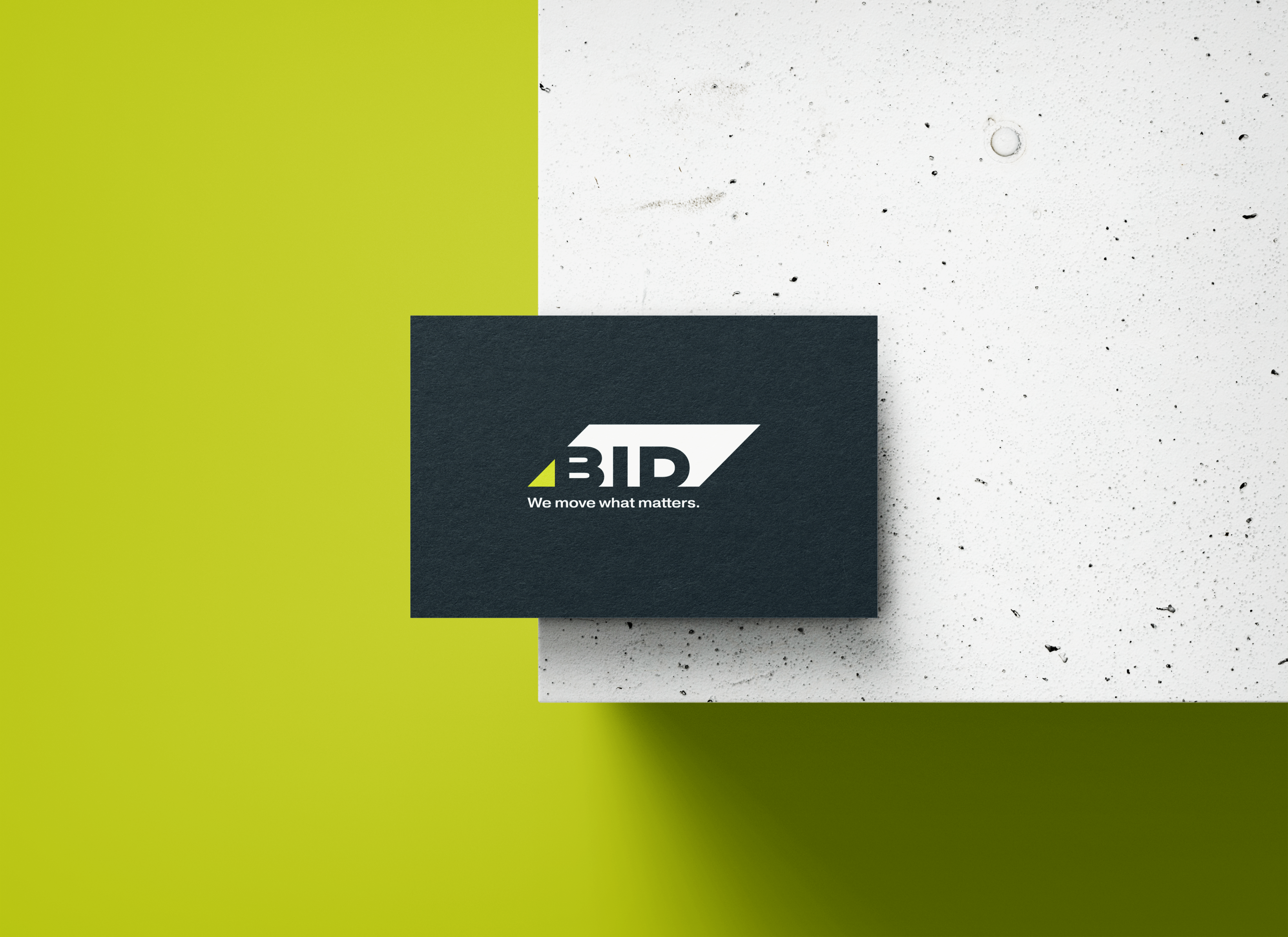
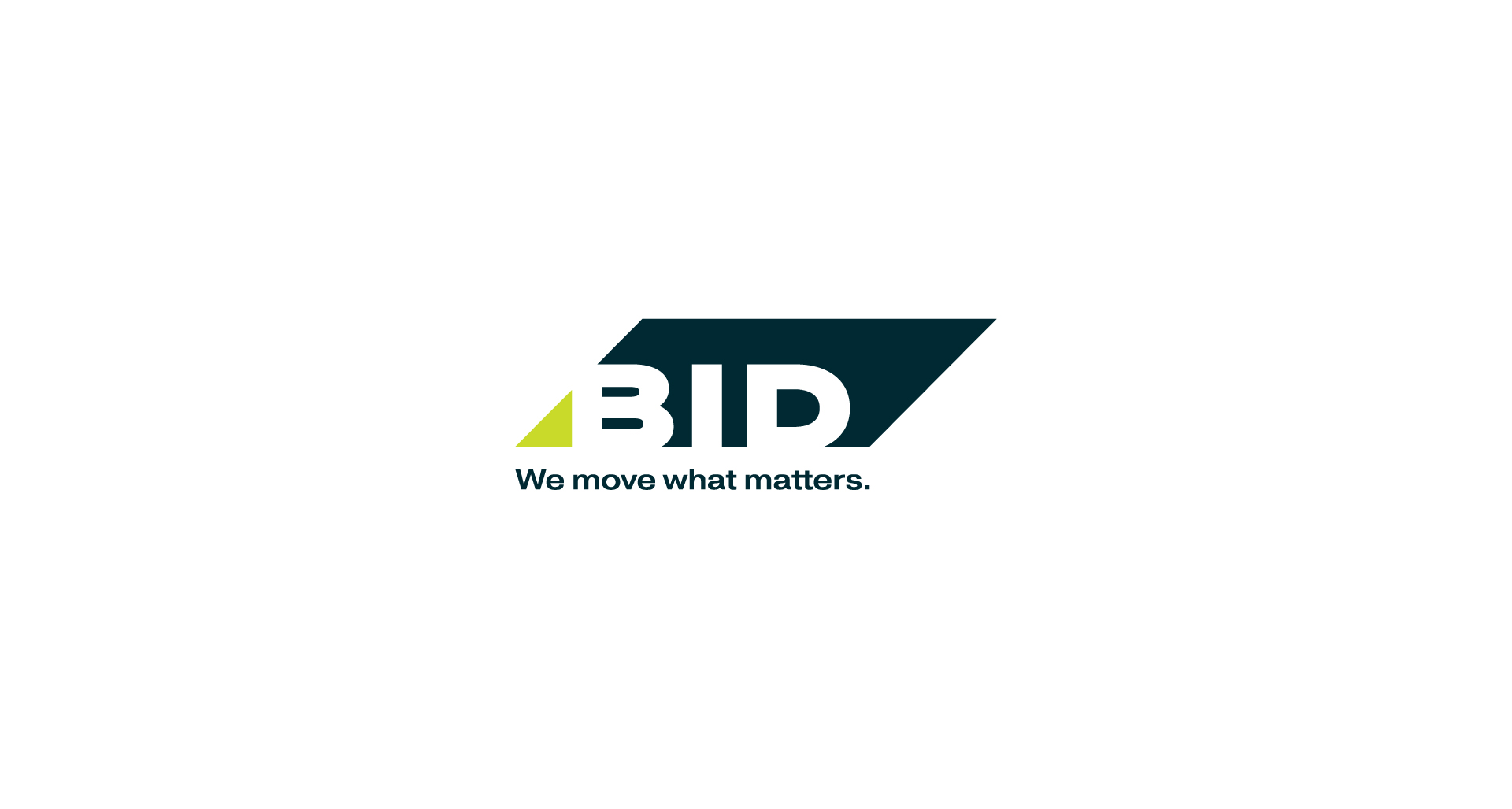
Having this in mind, the logo was created with the intention on representing the form of the conveyor, from a perspective that shows movement by its diagonals.
![](https://freight.cargo.site/t/original/i/e53592b13f6d2ee10421fe17a730bdd668bde854ab81e392b952f2461b1695c2/D2A8285-1024x682.jpeg)
![](https://freight.cargo.site/t/original/i/fd6aced4eef42dba1b488e444eb145cd4bfba6200bc74b72f2780b038a537acb/BID-2.jpg)
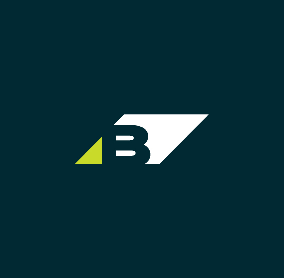
A symbol for smaller and secondary uses was created, by reducing its shape and maintening the first letter of the company’s name.
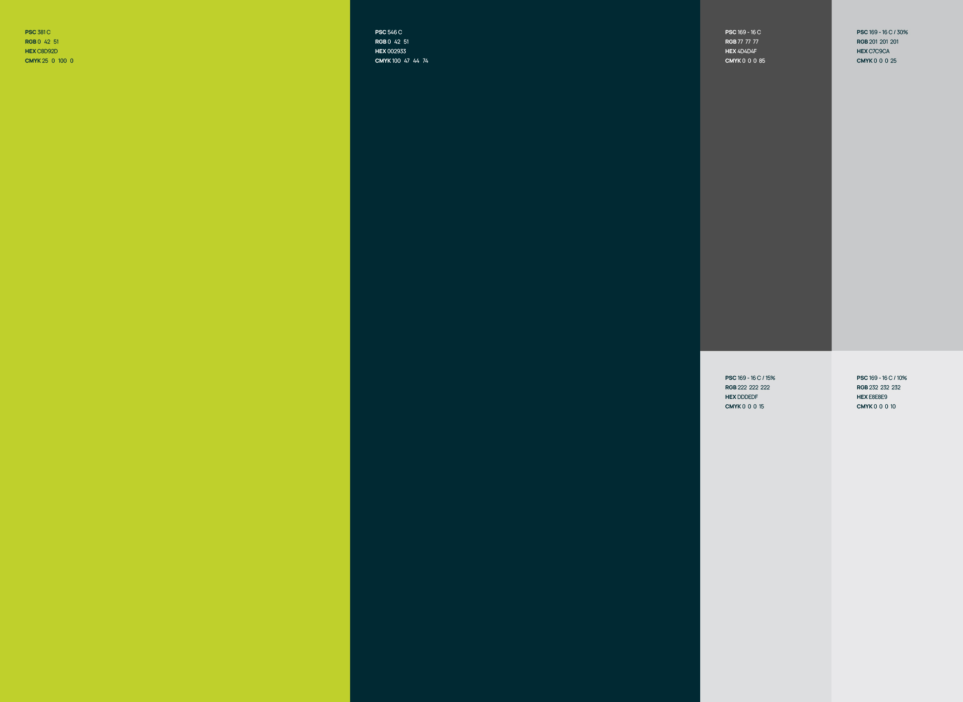
![](https://freight.cargo.site/t/original/i/8a98fce67f26a046a78066977f2e7036dfc13c5060f692ae9d3b23748a7c1161/BID-3.jpg)
Colors
A dark blue is the main colour of the brand, pared with a lime yellow as an accent, that sometimes takes more space to make a point, or to be bold and daring.
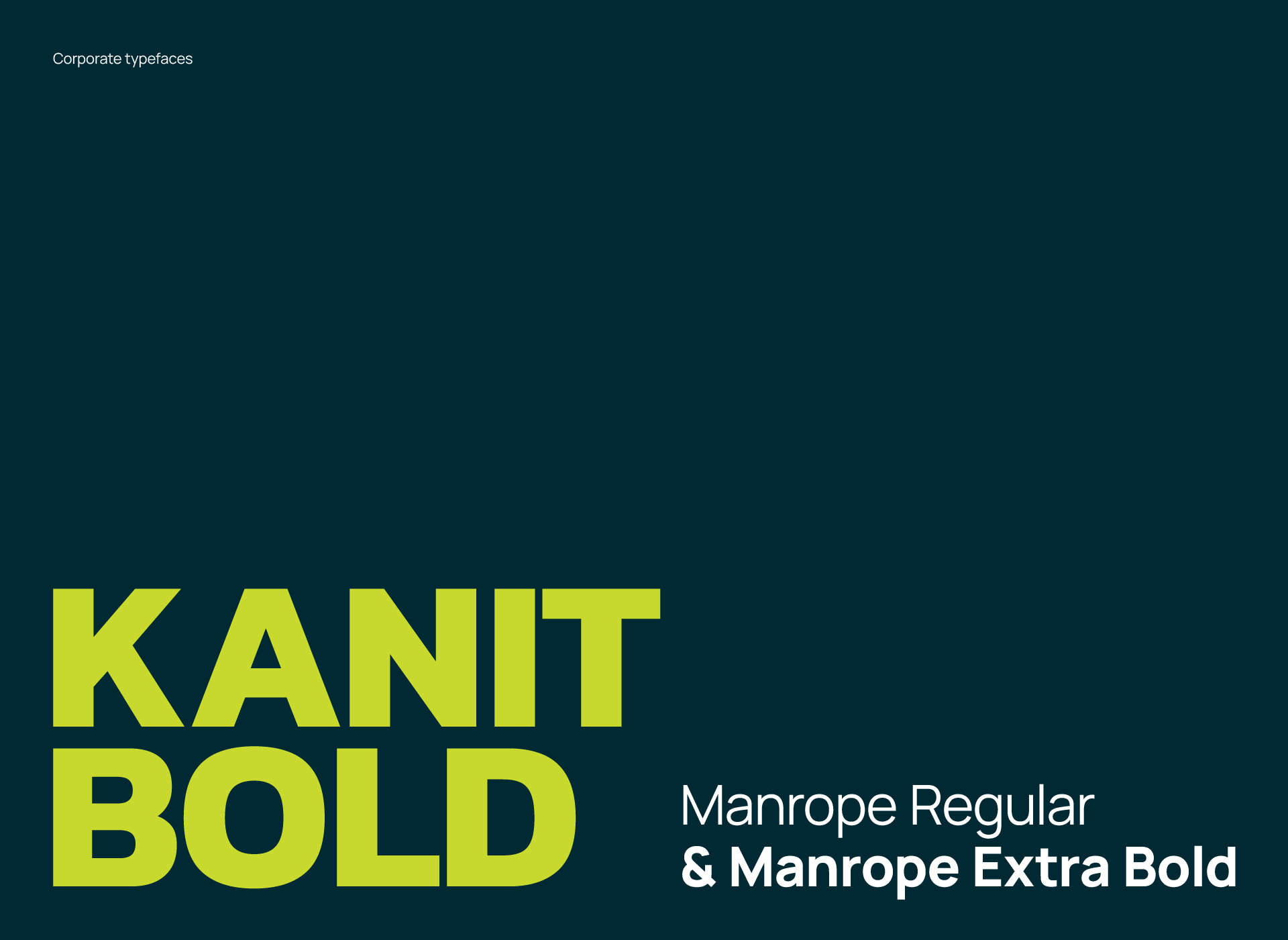
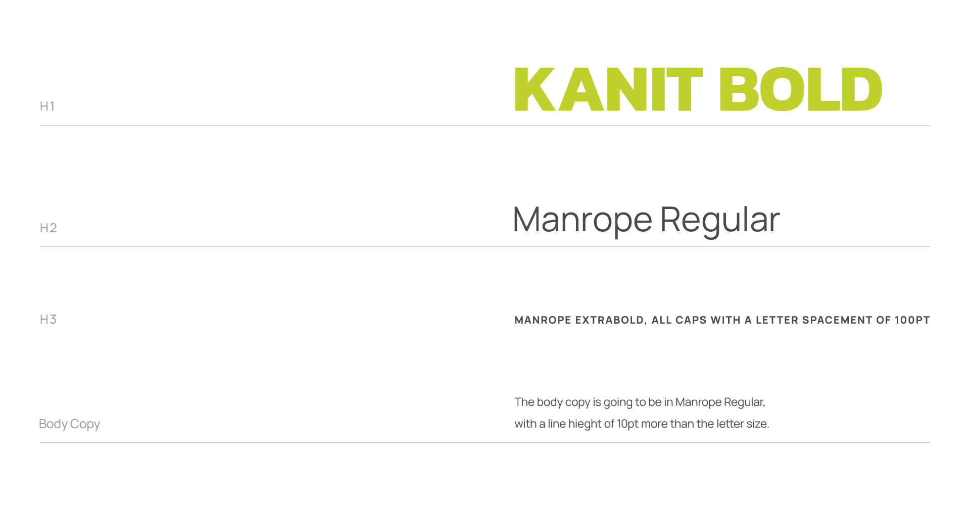
![](https://freight.cargo.site/t/original/i/3ed066e39231cad036ee2408a256b7a352dda1d869942ef6e0c0f187cd942bd1/BID-4.jpg)
Typefaces
Kanit Bold represent the primary typographic voice of the brand. While Manrope rests as a secondary typeface that is more discreate and simple.
![](https://freight.cargo.site/t/original/i/fcf122d9ad0daf1d4866f0454b01506ba6ea71b51b8720e6be2f2712dfbfc0fe/BID-6.jpg)
![](https://freight.cargo.site/t/original/i/7b824781499c8c9b918db38acc7407006c904e492caa0104e30ed466422075c2/BID-7.jpg)
![](https://freight.cargo.site/t/original/i/9d9d73c0f64a4abff1382b021e6c34133c764f2b461dcc5e9c24ab744644047a/Perfect_Binding_Brochure_Mockup_3.png)
![](https://freight.cargo.site/t/original/i/d8a20ce155a3e1196c292b60a99da71d2d629c0c4d574b7fecbbeb64a6260457/Free_Business_Card_Mockup_2.png)
![](https://freight.cargo.site/t/original/i/8a49362356433ab4ec6f691313a1166a97d274f9aaa110a9123eb0c34f93cd9b/BID-9-Web2.jpg)
![](https://freight.cargo.site/t/original/i/35c6313ffa28b5d958f940032cb0cd589da2fdde99474e1cdfb2ef483161a2d2/Artboard-323-copy.png)
![](https://freight.cargo.site/t/original/i/2cbf32563f2b821d7ae5e8b84e8540fbdd9554f4d579d18cc04ed5096cc66f83/Artboard-318.png)
![](https://freight.cargo.site/t/original/i/36e3eb51f276995adf3ae05385de89aac7529061955256d62a2f728169030f36/Artboard-320.png)
![](https://freight.cargo.site/t/original/i/0790c03941934d75bc8362adc4e8651ec0eda26852c27af0e642cdbccf58cb39/Artboard-321.png)
![](https://freight.cargo.site/t/original/i/efddffbbd4b021d582ab23b08ed5a6fac82337875a5e1f9043f41c929fd2536e/Artboard-322.png)
![](https://freight.cargo.site/t/original/i/7f0019b61f7acb6e5b5adbe6a89f2b4f13564551362b850a64df6f1d1e986be0/Artboard-323-copy-2.png)
![](https://freight.cargo.site/t/original/i/82a1846f2f6557a23ed4c1d90b0ff9ba17059be313327793e80e942ebc465198/Artboard-323.png)