EF Campaign
Visual identity + Motion designThe city of Fredericton (New Brunswick, Canada) created a platform for public participation, wanting people to come up, participate and give their opinion on different topics and projects. The client requested something cheerful and simple.
We developed the visual identity of this project and apply them to a variety of digital pieces.
Agency: The Ginger Agency
Creative direction: Susana Rojas
Animation & sound design: Manuel Martín
We developed the visual identity of this project and apply them to a variety of digital pieces.
Agency: The Ginger Agency
Creative direction: Susana Rojas
Animation & sound design: Manuel Martín
Promotional video
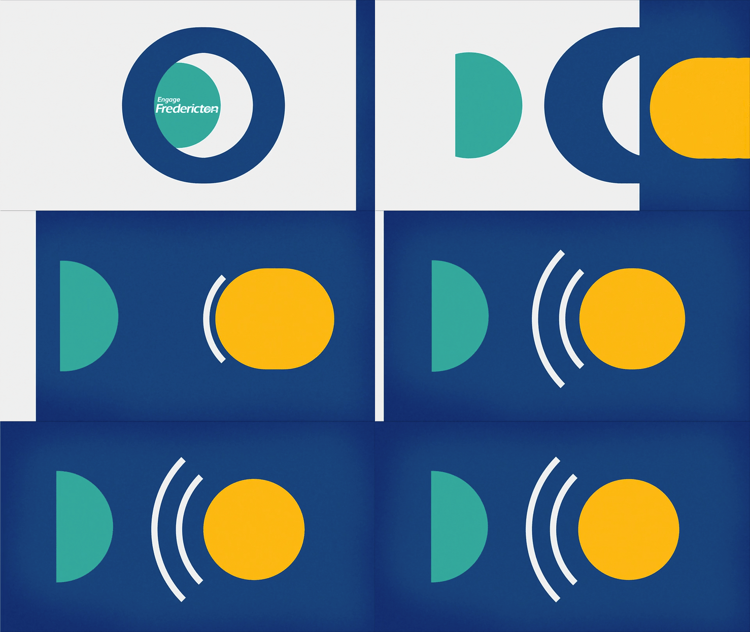
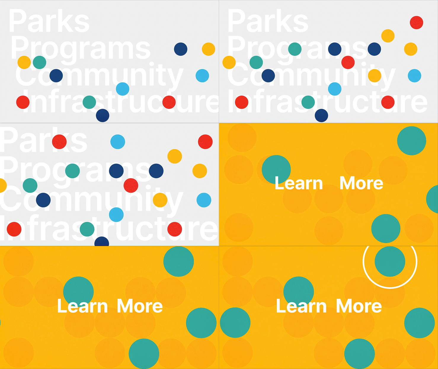
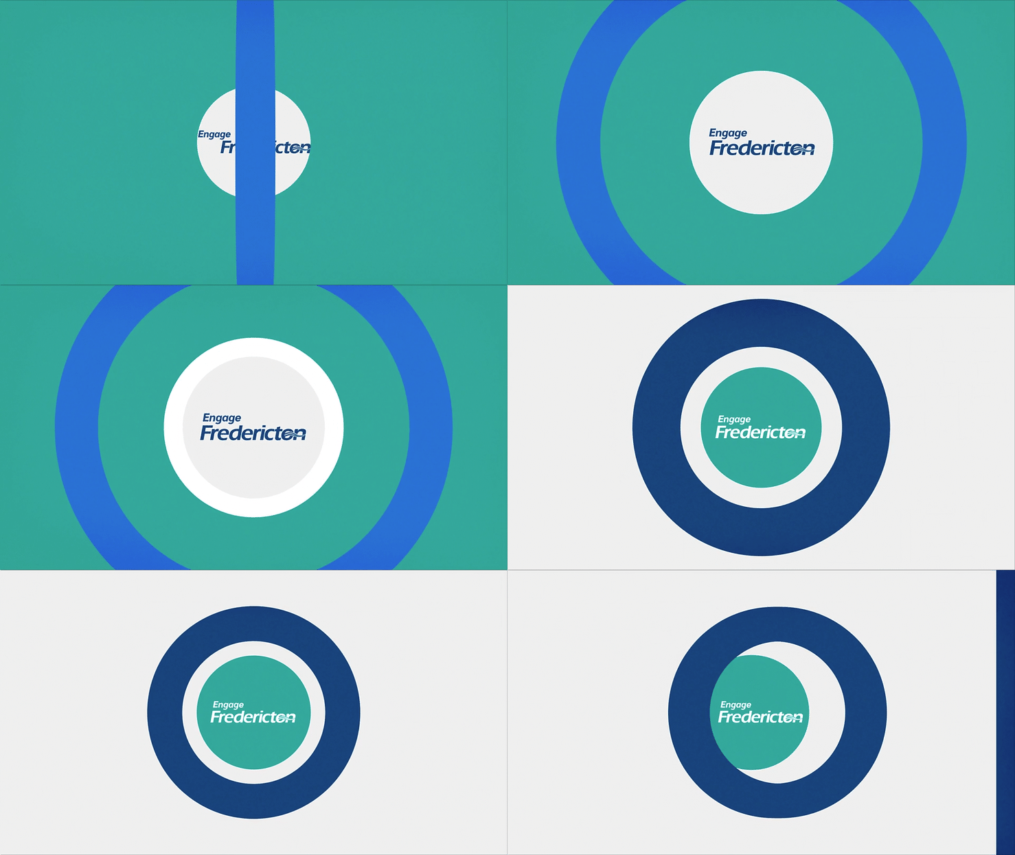
We work with the simplicity of geometric shapes to generate a dynamic and fun video.
We work with the simplicity of geometric shapes to generate a dynamic and fun video.



︎︎︎
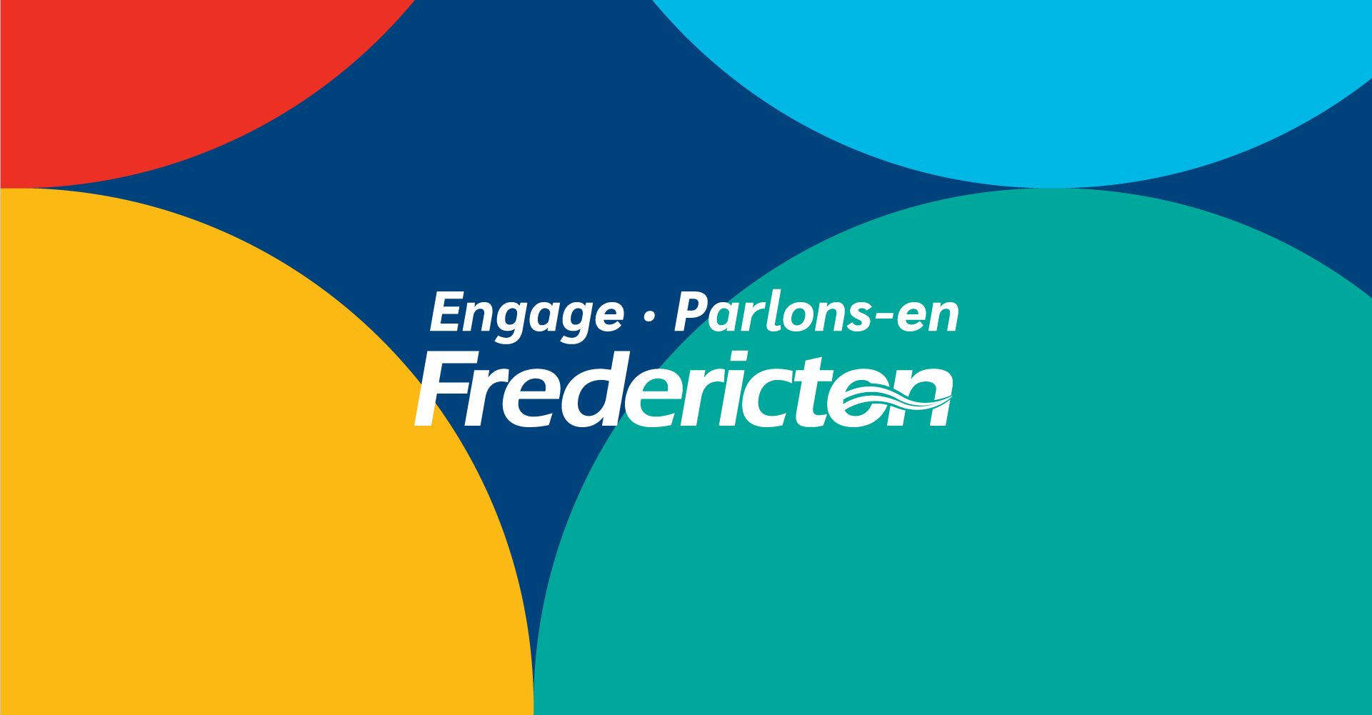
The Fredericton logo existed already, so to make this sub-brand we added the bilingual words, with the idea to keep it simple but also for people to recognize the city’s brand.
The Fredericton logo existed already, so to make this sub-brand we added the bilingual words, with the idea to keep it simple but also for people to recognize the city’s brand.
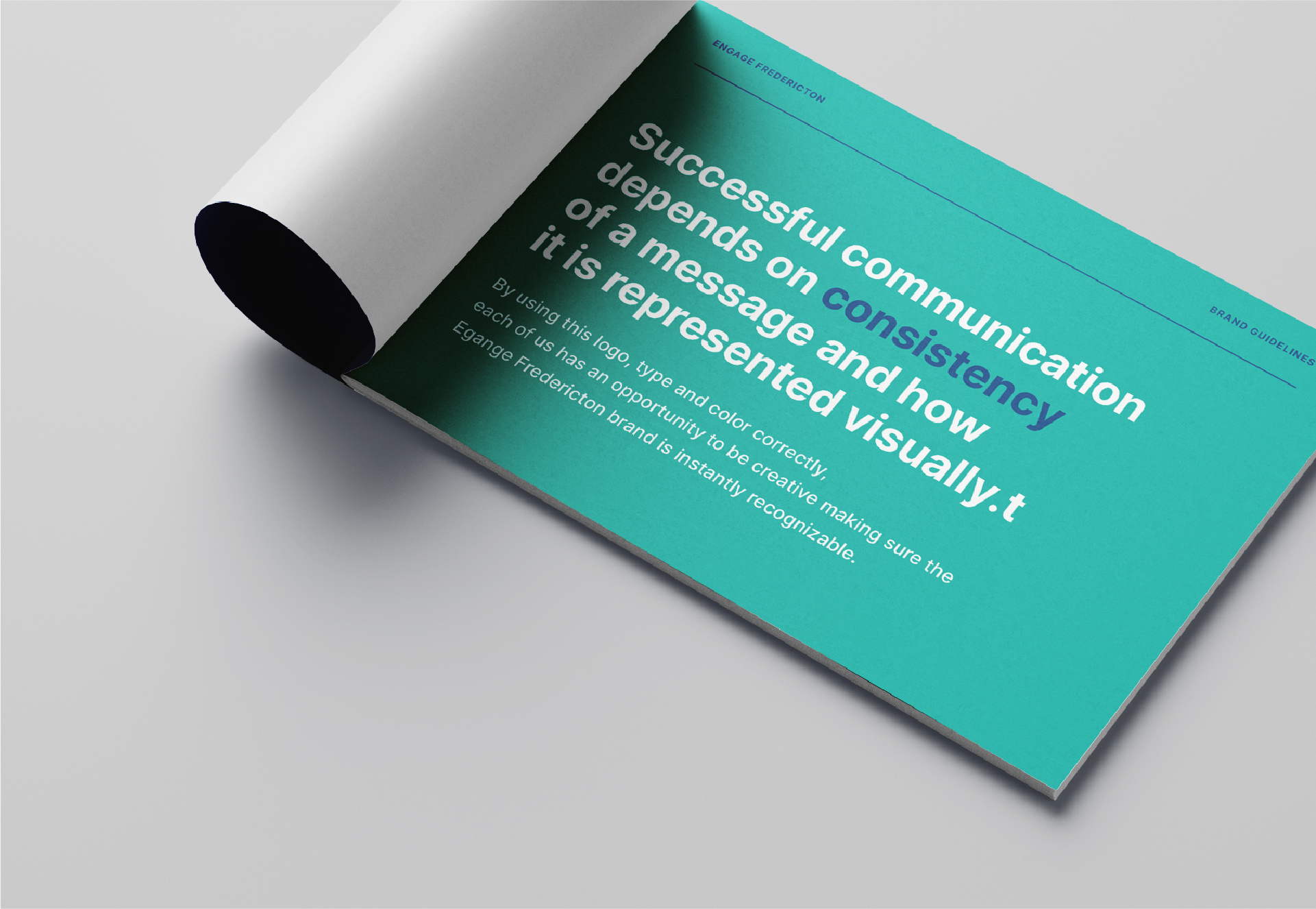
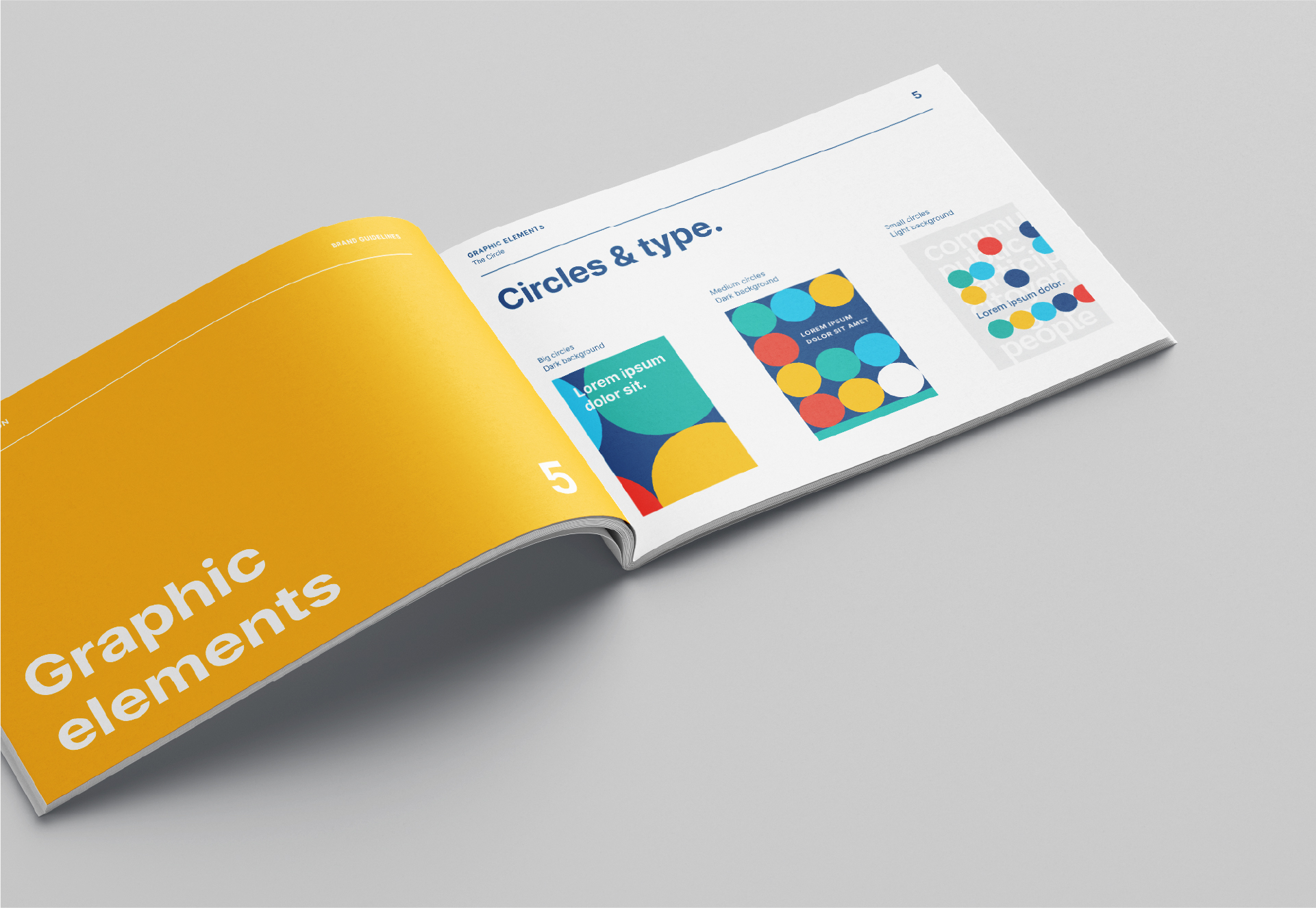
We decided to make a brand with really simple geometrical shapes. These not only are use as ornament and brand elements, but also they were used to construct a story, as seen in the video and digital pieces.

Because this project was going to live mostly in the screens, we choose an open source typeface made for it.

Some primary colors were picked because of the feeling of universality they transmit, along with a teal and a dark blue to make it more fun and have also more contrast.
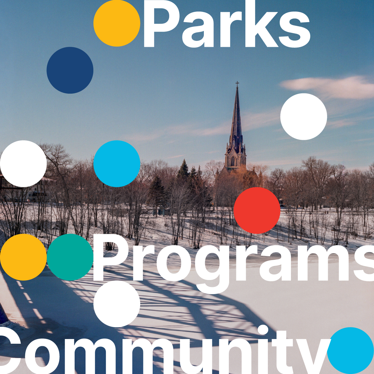
We also carried out a digital campaign on Instagram, Facebook and LinkedIn, for which these pieces were developed.

